
Hello everyone..! I am doing great and hope you are as well. This is my very first blog….okay! Let me introduce myself, this is Pooja and I am here to share my experience of using Tailwind CSS.
I have started my career journey in Spritle Software as a Front-End Developer Intern. Literally to say one thing when I joined Spritle my knowledge in tailwind CSS was zero. But they recommended I start my allotted project that is Medatics web page that comes under the healthcare domain with Tailwind CSS. I was not comfortable with a tailwind at that time because I was very new to that.
As days got passed, after learning tailwind and becoming familiar with its properties I have come to know that it’s my favorite framework of CSS. Moreover, it also will be my favorite in my future concern because it’s the first framework I have learned.
Here, I’ll talk about the Benefits and the Challenges of using Tailwind
Okay first let’s see what it is!
Tailwind is a utility-first CSS framework. In contrast to other CSS frameworks like Bootstrap or Materialize CSS it doesn’t come with predefined components.Instead, Tailwind CSS operates on a lower level and provides you with a set of CSS helper classes. By using these classes you can rapidly create custom designs with ease. Tailwind CSS is not opinionated and lets you create your own unique design.
Benefits:
Let’s look at some of my favorite things about Tailwind. It’s not strictly just Tailwind, but the benefits of why the utility-first concept is so awesome!
No more naming problems:
One thing that I hate about styling is coming up with names. Should I name it primary-link or primary or do I follow something like primary__link?
Needless to say, naming things are complicated😖.
If you use Tailwind that goes out the door, I can add the styling right inside the HTML tag, like styling inline. It doesn’t pollute other similar tags and it is scoped to a specific tag.
red color link
default color link
Fewer codes and Speed:
The ability to add styling has never been this faster. I mean its consists of fewer codes than CSS. Let’s do a scenario comparison:
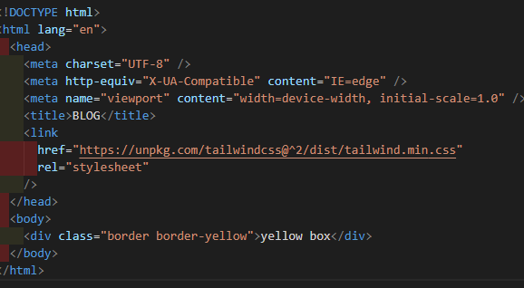
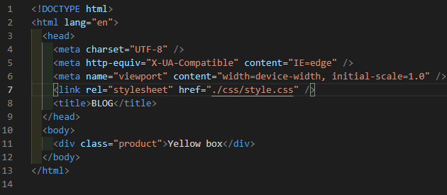
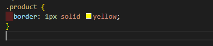
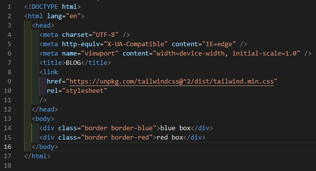
Your company sells blue boxes. So your manager asks you to create a yellow box.
the Tailwind way:
the CSS way:
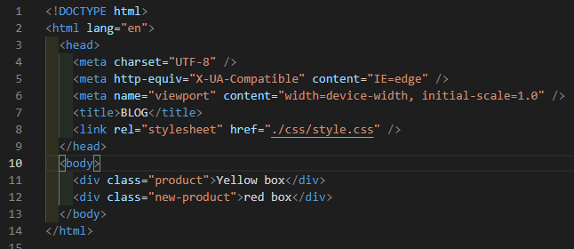
HTML Code:
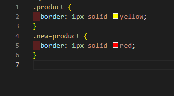
CSS Code:
Few months later your lead or your project manager said they can now create red boxes. So please add the new product to our inventory.
the Tailwind way:
the CSS way:
HTML Code:
CSS Code:
And this can keep going …Hopefully I painted a picture of why the utility-first method is such a game-changer. The speed is no match. It easily adapts to growing changes in your app without introducing new a CSS.
Fast to make to changes, fast to implement, no more digging into your CSS files 💨
Pseudo Classes & Responsiveness:
Tailwind is more responsive and it’s a easy framework to make your website responsive in a good way.
So I mentioned how Tailwind is similar to inline styling. Where you apply style without leaving your HTML and it is scoped to a specific tag. One thing that inline styling can’t do is the handling of pseudo-classes. But Tailwind can!
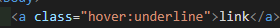
☝️ See how easy it is to read. When the link is hovered, underline the text.
Making it responsive:
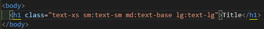
The text is increasing in size as you move to bigger screen sizes. How easy is that! You don’t have to deal with media points. And what a breeze to implement. I love this feature!
Breakpoint prefix Minimum width CSS
sm 640px @media (min-width: 640px) { … }
md 768px @media (min-width: 768px) { … }
lg 1024px @media (min-width: 1024px) { … }
xl 1280px @media (min-width: 1280px) { … }
2xl 1536px @media (min-width: 1536px) { … }
Flex and Grid:
Advanced topics like flex and grid are also available in Tailwind which makes our website works easier.
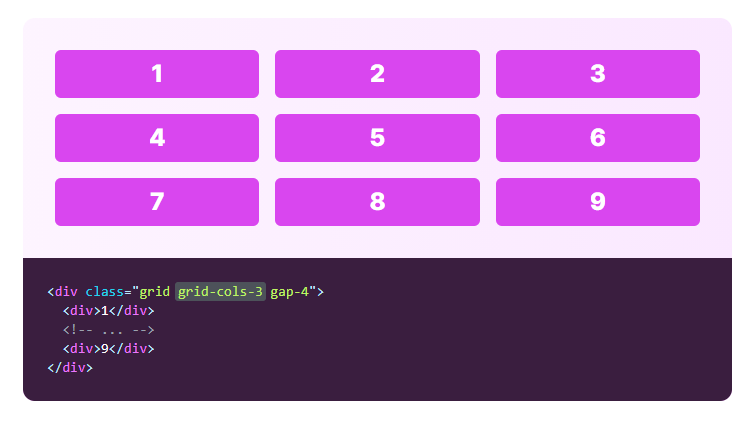
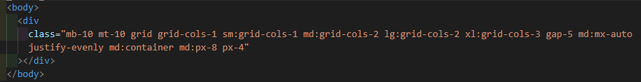
GRID:
Use the grid-cols-{n} utilities to create grids with n equally sized columns.
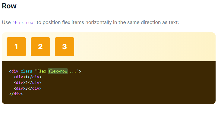
FLEX:
Challenges of Tailwind:
What ever it may be always everything has a good side and bad side. Tailwind also have some challenges and let’ us see what they are:
Repeating CSS:
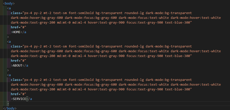
One of the biggest annoyance of utility-first is the repeated classes. In the above example itself you can understand what I am trying to say.
Readability:
This is probably the biggest downfall of a utility-first concept. Adding a few classes is fine. But when you’re adding tons of CSS classes, the readability can definitely be challenging.
By seeing the above example you can understand my mind voice right 😂 “LOL”.
Let us all meet at the next blog with my other experience..
Thank you!
u can reuse th repeating css by usigit as components check v2
@apply{}
https://tailwindcss.com/docs/extracting-components
Inspired