
Hello, Sid over here! and what you guys are going to see is what went through my head before the creation and the design of a sports application and how it came into existence. The application aims to make attending, tracking, and managing track meets & events easy for people.
I wish not to take up much of your time. Below is a fair share of what I went through to get a portion of the design completed. By no means did it simplify the pain stalking process of spending countless hours to produce something flawless.
THE DASHBOARD:
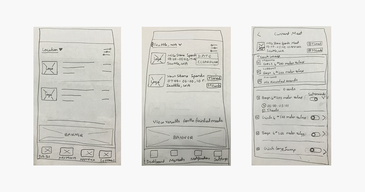
Initially, before designing a page I create a rough outline, which is the image you see above. It has a basic structure consisting of icons, elements, and filters. Initially, the filter was but a simple button that would allow a simple sorting action.
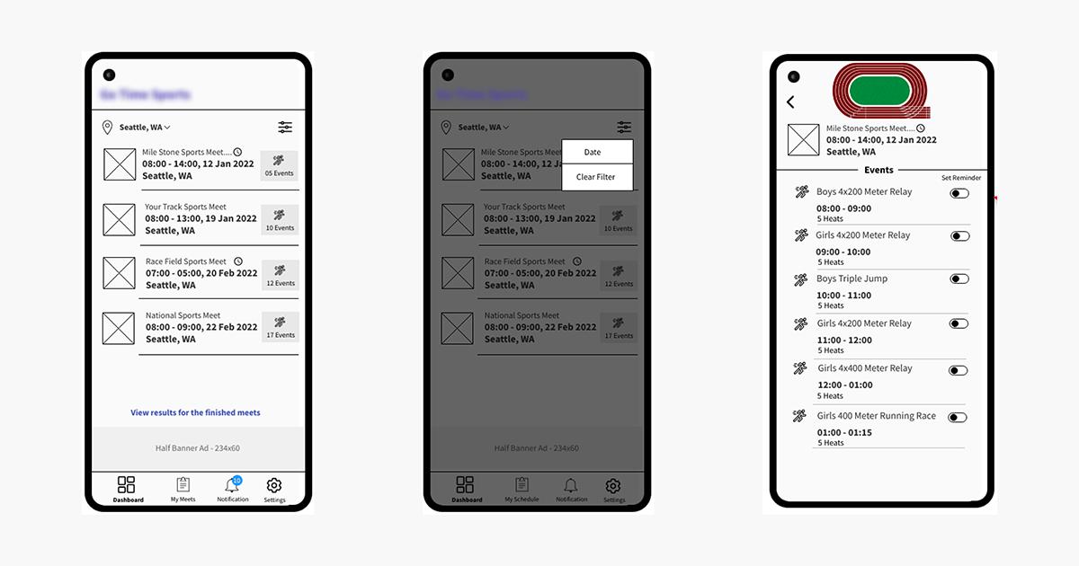
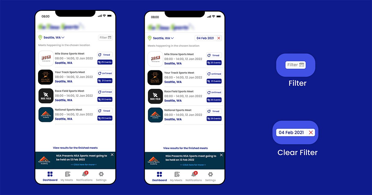
However, the design was further enhanced to show the meets based on dates along with a Close option that would instantly clear the applied filter, as you can see in the below images.
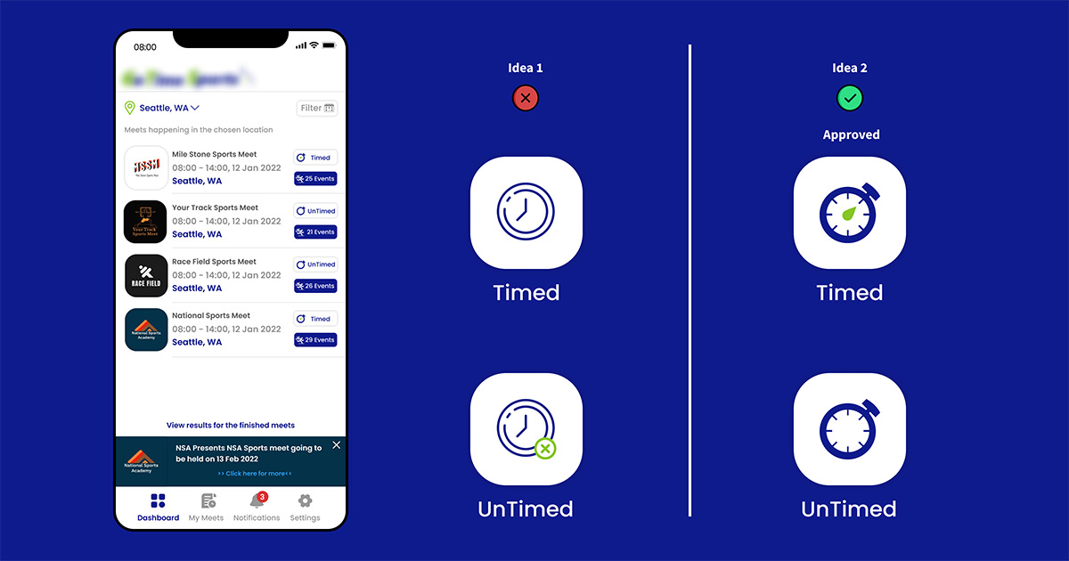
TIMED OR NOT TIMED?
Apart from this, the design was made to show if the meets were timed or untimed. To differentiate this at first, I used the stopwatch icon and if the icon had a small green cross on its bottom right corner then it would be an untimed event, and if not, then it would be a timed meet.
As it happens in designing, the idea was not to everyone’s liking. Therefore I went with my second choice which was to settle on keeping the clock hand in the meets that were timed and took them out if they were untimed, and this managed to satisfy the Client as well as the Project Team.
TRACK DESIGN:
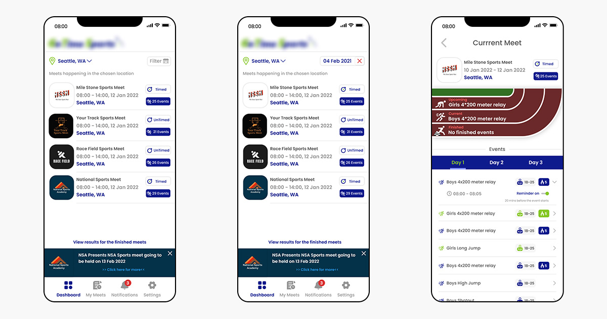
The client for whom the application was being developed asked to include a track in which the events would be displayed and the first attempt at doing so was not a success.
Then, implementing icons of people doing a set of spotting actions was used in 3 different scenarios,
- Events that were yet to begin (upcoming) had a figure of a sprinter getting ready to run.
- The current events had an icon showing a man running.
- And the finished events were displayed with the icon of a man crossing the finishing line.
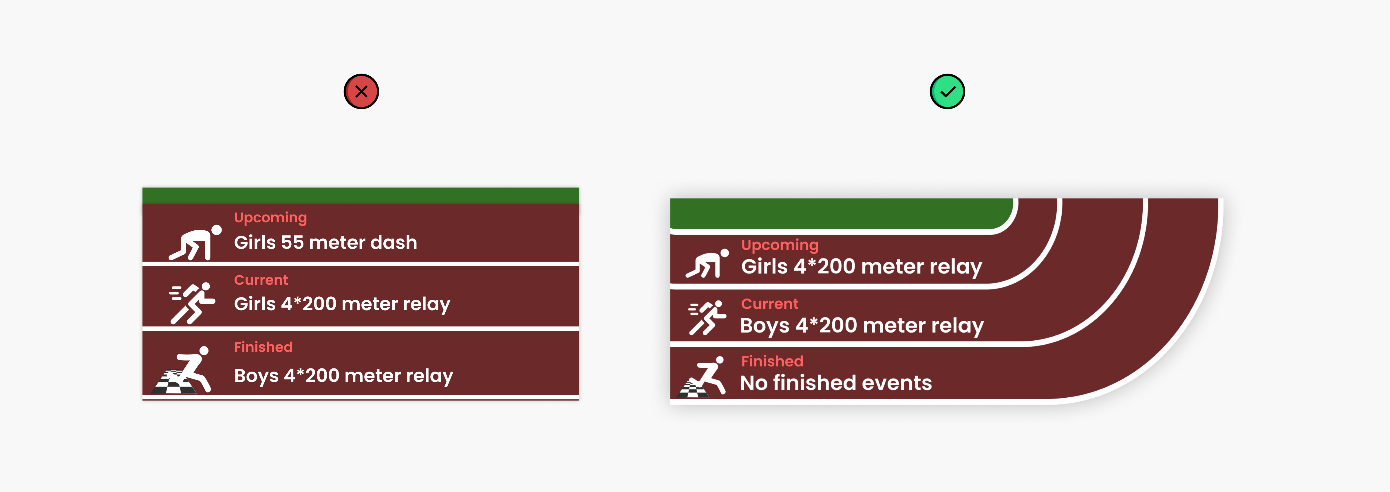
That idea did not click either which gave a simple yet feasible solution. Though this helped, it still wasn’t enough so I had to design a track from scratch adding a place for the audience using two different stadium outlooks.
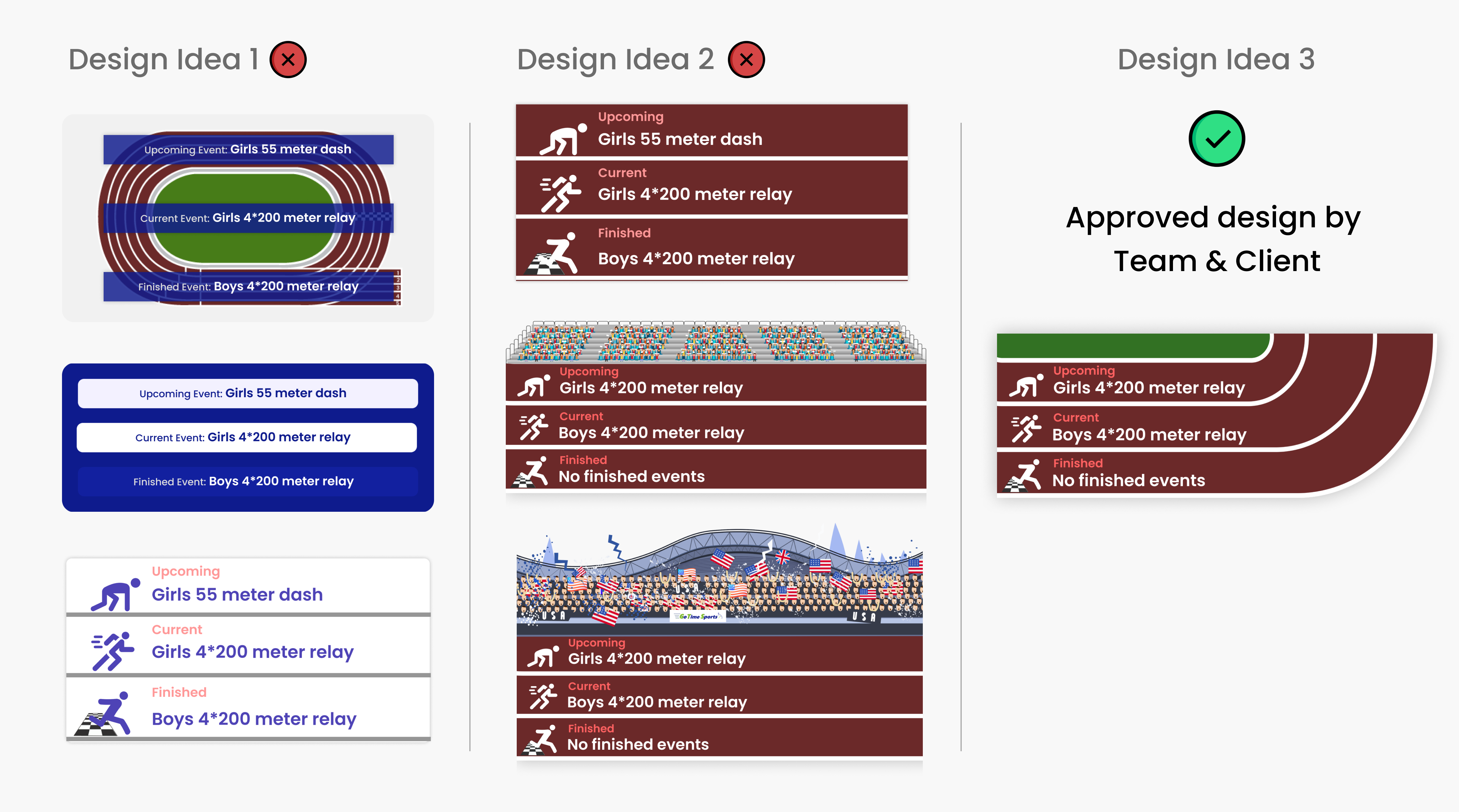
However, this garnered a mixed response from everyone. I then wondered if I could cut the track in an L-shape and place the icons running in accordance with the track while getting rid of the audience, and it was a successful attempt. Everyone was happy with the track image design & got approved by the client. Below is the approved design put forth.
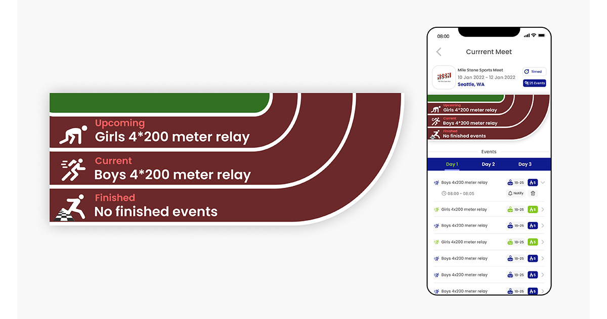
At first, during the development stage, it was fine within the company’s testing device, but later when it came to testing on other mobile devices, the dimensions & size of the track image got changed and this impacted the icons & the text being displayed on the track image.
To eliminate all these issues, we worked a lot on the track image. When we had the image horizontal without the curve (as shown below) it worked fine on every mobile device, but when the curve was added, the entire image got distorted.
The client was very particular about the design with the curve. Hence after a lot of discussions, one of our developers came up with a solution to develop the track image by declarative UI in React Native. This helped the track image to fit onto all the mobile devices (IOS & Android).
Also, we have an idea to animate (like giving some actions to the sprinter icon) the three icons used in the track image which will be coming in the feature updates.
THE CURRENT MEET:
This screen had to undergo countless changes since we had the concept of multi-day events for a single meet. A question arose for the development team as to how to display the multi-day events and all other app features dependent on the events list?
I felt it would be better if we showed the events happening each day. Well, I had to add a few new columns to display all the information.
Then came the issue of the Notification button that was initially meant for all of the events, where I added a notification icon near every event. Then came the delete button that could not be added to an ongoing event so I thought the delete button over there had to be removed. But then the client also asked to remove the red color because of the multicolor aspect and to make it monotone.
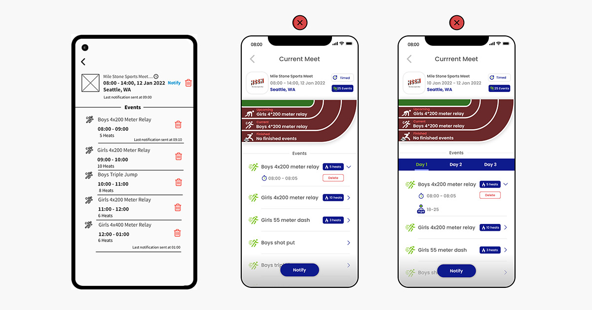
Later they asked me to include the age limit of the athletes and this made a mess on the display. After trying many different combinations we settled on a suitable one that grouped all of the 4 elements Delete, Notify, Age and Heats together.
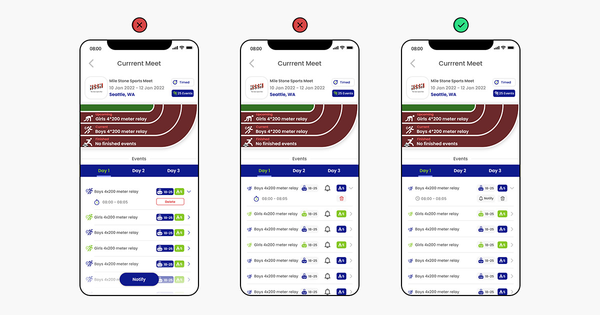
Last but not least came the next issue of Gender differentiation. I sorted it out by making all the green-colored running icons with a small ponytail for girls and all of the blue-colored ones for boys. The client approved this and was really happy with the design made.
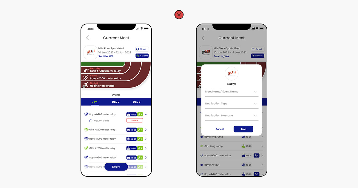
NOTIFICATIONS:
The initial design done was actually like running the longest distance to reach the desired destination instead of taking a shortcut. Let me explain the process.
- Firstly, you would click on the common “Notify” button to create and send a notification to the users.
- Then you would be taken to a pop-up, where you have to again select from the list of events, the notification type, and the notification message.
- Then hit notify to send the notification across the users.
It is a bit long right!
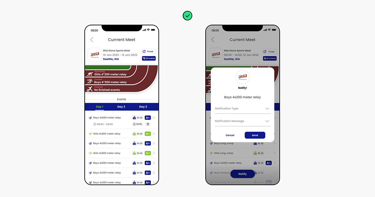
Now, changing the design and perspective a little bit, the common notify button was removed and added to all the events. Now if you want to send a notification for any specific event, you just have to hit the notify button beside it. The next steps are the same. Choose the notification type and the notification message to send it to all users.
It is evident that one step has been reduced in the process. Minor design changes really can save your day!
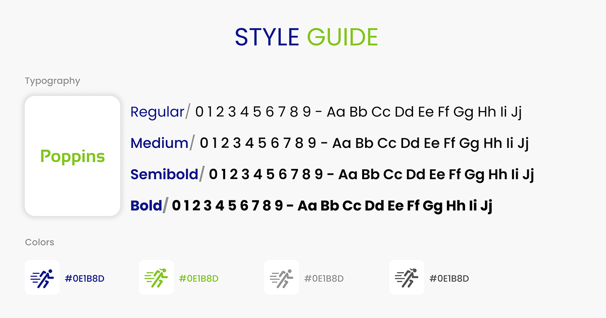
Not only imagination and creativity give a good design, but also the fonts we choose! Have you ever wondered, a design you saw online will look incredible but once when you try to make changes, hmm, might not be appealing?
It’s because the design’s originality changes when you change the font. The designer would have put some thought into it. In conclusion, font styles also contribute to a perfect design.
Here, I have used Poppins because it has all the types of font styles starting from Bold to Regular. That is how a designer decides the font.
As much as everything is important in designing, a complete and suitable design tool is also essential. Below are the tools that helped me in curating the eye-catching design for the sports application.
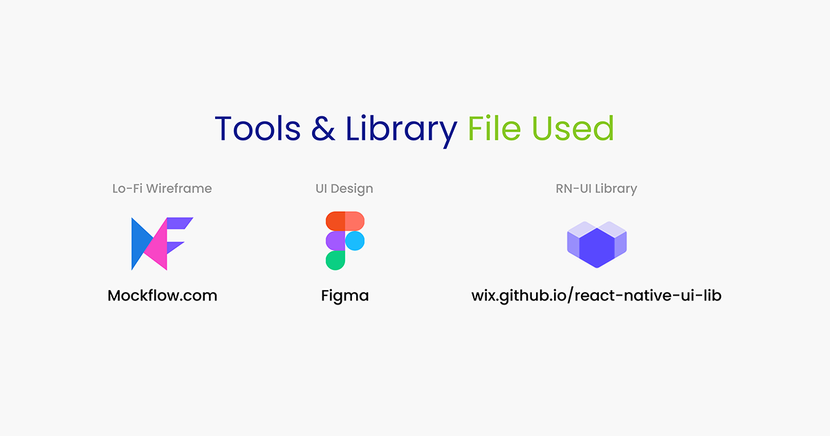
- Mockflow: https://wireframepro.mockflow.com/
- Figma: https://www.figma.com/
- RN-UI Library: https://wix.github.io/react-native-ui-lib/
This is how I went about rectifying, adjusting, handling, and organizing changes that had an effect on the User Experience. If you think that this is where all the process ends, you couldn’t have been more wrong because we’ve got a second part coming up based on the UI we used for the web application. So for those of you who wanted to know more well stay tuned!