
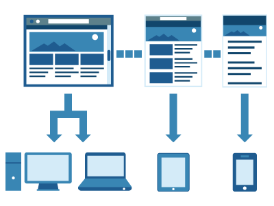
Responsive design is an approach for providing a single web codebase for multiple devices like desktop, tablets and smartphones (and sometimes mobile phones).
There were many CSS Tools and boilerplate frameworks available to design a responsive web site. Lets see some of them..
1. Media-queries:
In CSS, web developers can define a media type such as screen, and specify the look of the content by specifying conditions such as width, height, or orientation. A media query combines a media type and a condition to specify how web content will appear on a particular receiving device.
- For targeting desktops, we can use
[source language=”ruby”]@media only screen and (min-width:1224px) { /* styles */}[/source]
- For iPad portrait mode
[source language=”ruby”]@media only screen and (min-device-width:768px) and (max-device-width:1024px) {/* styles */}[/source]
- For iPad landscape mode
[source language=”ruby”]@media only screen and (min-device-width:768px) and (max-device-width:1024px) and (orientation: landscape) {/* styles */}[/source]
- For smart phones(landscape)
[source language=”ruby”]@media only screen and (min-width:321px) {/*styles*/}[/source]
- For smart phones(portrait)
[source language=”ruby”]@media only screen and (max-width:320px) {/*styles*/}[/source]
2. CSS frameworks:
We have many css frameworks which contains single CSS file with fluid grid system that will rearrange or resize the web page based on the device screen width. Some of the frameworks also provide design for buttons, forms, table.
- Twitter Bootstrap
Bootstrap was built as a style guide for internal tools at Twitter. Designed to kickstart development of webapps and sites, featuring simple and flexible HTML, CSS, and Javascript for popular user interface components and interactions.
- Mobile boilerplate
A mobile-focused app template comes with rich set of mobile focused tools, helpers and Apache settings to help to deliver excellent site performance.
Major components of this framework are:- respond.js
It is a script to enable responsive web designs in browsers that don’t support CSS3 Media Queries – in particular, Internet Explorer 8 and under. - Modernizr
This library runs quickly on page load to detect the availability of HTML5 and CSS3 specifications. It tells whether the current browser has the specific feature natively implemented or not.
- respond.js
- Kube framework
The Kube Framework is not an overblown responsive CSS framework with multiple layouts and styles, all you have with Kube is a single CSS file. That is were its beauty lies – in its simplicity. The framework also supplies LESS files for the gurus out there who enjoy preprocessing.
- One% grid
One% CSS Grid is a 12 column fluid CSS grid system. It’s been designed as a base for building responsive web layouts easily, quickly and with minimum effort. You don’t have to take care of resizing and rearranging your layout for each platform separately. One% CSS Grid will do all this for you.
This framework contains main One% CSS Grid css file and 2 types of grid pages (1200, 1000).
- Gumby Framework
The Gumby framework takes the 960 grid that we all cut our teeth on years ago and brings it into the modern age of web design with a responsive touch. It also has prebuilt styles for things like forms, buttons, toggles, dropdowns, tabs.
- YAML4 CSS Framework
YAMB developed in 2005, built on a few key features: a responsive fluid grid, dropdown navigation menus that automatically turn into select boxes on small screens, tables, RTL support, and responsive images/slideshows.
- 960 Grid System
It is a very small framework (180 KB) based on 12 or 16 column grids and width of 960 pixels. There are printable sketch sheets, design layouts, and a CSS file that have identical measurements. This framework is extremely flexible, which can be customized to 24-column grid also included.
Pros and cons of using CSS frameworks:
Pros:
- Using systems like these to make coding easier or repetitive tasks quicker, makes a lot of sense. However, over-reliance on these systems can be risky.
- We should be able to be up and running in a few hours
Cons:
- Particularly useful in providing compatibility with older browsers, especially Internet Explorer
- Most of these frameworks will provide bunch of tools or libraries which we may not use all in our website, it lacks the whole control of coding from us.
- Only few of the frameworks provide full documentation.
Image linked from
http://searchengineland.com/