
Many of us would ask me, what’s new about the monthly version of react-native.I was also banging my head into the wall to reply them. Now I am happy to report bunch of lists. One among them is support of iPhone X.I am really fascinated to see how react-native app works on iPhone X.
Immediately I searched google to see how it works, got some component named SafeAreaView
Unfortunately I couldn’t find SafeAreaView in React-native documentation,I read some post about usage of it.Immediately I get into my code editor and check how it works.I tried importing the component like Text
import {SafeAreaView} from 'react-native';
Then I have added the component SafeAreaView as the root for all the components as below.
render() {
    return (


    );
  }
I have styled the component with flex:1 and backgroundColor. But the problem I faced is with SafeAreaView in iphone X is it has some color(given in styles) in both header as well as in the footer like below.
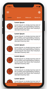
I don’t want footer as above. Also the safeArea and header overlap with each other. We were thinking off to get this to be resolved.
Then I tried to use normal View as root component by using the complementation of device-info library. The idea is just to style the safeArea(header) alone. So make use of padding property.
import DeviceInfo from 'react-native-device-info'
....
export default class Root extends Component<{}> {
  render() {
    return (
    );
  }
}
const styles = StyleSheet.create({
  safeArea: {
    backgroundColor: '#df6b2e',
    paddingTop: (DeviceInfo.getModel() == 'iPhone X') ? 30: 0,
    flex: 1,
  },
 ....
});
I had a discussion with my friend Prabakaran Marimuthu. He encouraged me with an idea of styling the header of each page since we are maintaining a header as a component. We need to change the style at once which will be reflected in all screens.
const styles = StyleSheet.create({
  header: {
   flex: 0.1,
   backgroundColor: '#df6b2e',
   alignItems: 'center',
   flexDirection: 'row',
   paddingTop: (DeviceInfo.getModel() == 'iPhone X') ? 30 : 0
 }
 ...
})
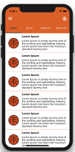
This is our desired result.
This is how I made our app to support for iPhone X. Thanks everyone. Kindly visit Spritle Software website to know more.