No, I am not joking but I don’t know how to react to this.
Google has helped me many times for many things and I am very much thankful to Google for that reason.
But I am also feeling disappointed and confused that they didn’t give the credit to the actual creator, why they need to do this ? I am very sure that they will be having one of the best design team in this planet, then what made them do this ?
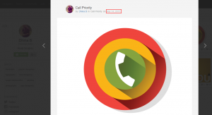
Ok, let me tell you guys what it is, the below logo was created by me nearly 7 months back for a project.

As you can see I published this design on March 14th 2017 in Dribbble.com while the Android O logo was released on March 21st 2017. 7 days is more than enough to grab the concept and make things out of it. Wasn’t it?
https://dribbble.com/shots/3360197-Call-Priority
https://dribbble.com/dhinaB
It’s 90% similar to what I created, they have changed only the colors and removed the icon from the top. Please check the below link and image of their logo.
https://android-developers.googleblog.com/
![]()
Why I am confident in saying it was copied by their designer(s)? because they did the same shadow mistake that I did. Any designer can find the mistake if they spend some time looking at the design.
Here is the back-to-back comparison.

Another thing is there is a another logo in their article, which explains about adaptive icons and that icon or logo matches the name “Android O”, is this the actual logo they created before ? did they changed their mind at the last moment ?
Check the links and image below,
https://android-developers.googleblog.com/
https://developer.android.com/preview/features/adaptive-icons.html

I know that I created this logo 7 months back, work file in my PC will tell the date and Dribbble.com will tell the date when I shared in it.
I don’t understand how this could happen. Could this be a ‘coincidence’ ? Could a mistake also be repeated if it is a ‘coincidence’?
Even I know that using lengthy shadow in a icon will look alike material design kind of thing.
But using 3 circles and shadows in that particular way is what I doubt about..
A logo with 5 circles can be designed in many ways, but creating a logo with 5 circles similar to Olympic symbol is something different, we cannot go just like that by saying circle is a common thing, because there is a creation and logic behind the circles, 5 circles represents 5 continents.
Similarly there is a logic behind why I used 3 circles in my design…but what made google to use 3 circles ? Is there a logic or any connection between number 3 and Android O ?
I am really confused and disappointed with this.
I also feel pity for Google.

Sorry to break your bubble but that shadow thing you’re speaking about is one of the Material Design Guidelines by Google.
So evidently you made an icon based on Material Design. That is why “the directionof the shadow is the same”.
But again you have blown up the colours in your icon which is not Material Design recommends.
Please Google for ‘Material Design’. If you already knew it then you should know that your statement is invalid even before you stated it.
Please stop making a fool of yourself… Peace 🙂
I think you’re the one making a fool of yourself, Harsh. There are many other elements in the google design that coincide with the stolen design. You kind of have to be a fool not to see it.
This cannot be denied just by saying that shadow been used so its material design kind of design.There is some creation other than the shadow. Which raises the doubt.
Even I know that using lengthy shadow in a icon will look alike material design kind of thing.
But using 3 circles and shadows in that particular way is what I doubt about.
A logo with 5 circles can be designed in many ways, but creating a logo with 5 circles similar to Olympic symbol is something different, we cannot go just like that by saying circle is a common thing, because there is a creation and logic behind the circles, 5 circles represents 5 continents.
Similarly there is a logic behind why I used 3 circles in my design…but what made google to use 3 circles ? Is there a logic or any connection between number 3 and Android O ?
There’s no doubt in my mind this was lifted from you. None at all.