
In today’s busy world, the websites are not just viewed on a laptop/desktop but mostly on smartphones/tablets on the move. Especially, when it comes to healthcare, people/patients spend a lot of time searching the internet to identify, compare the best treatments, hospitals, prescriptions, insurance, answer to intake/Survey forms, and more. Patients try checking providers’ websites before making a decision about their treatment preferences. When searching for important details they could easily get frustrated with a non-responsive website and if they can’t get their hands on the right information immediately.

Regardless of which device they use, people want an intuitive and easy-to-use website, and of-course the newer generation has a lower attention span and less patience to sit through a slow-loading website. A responsive website will always adapt to various screen sizes, resolutions, and mobile devices constantly coming up with newer models in the market.
Similarly, we thought of enhancing our “Healthcare application – Patient portal” since optimized long back (almost 5 years back). The tech stack in which it was built is Bootstrap, AngularJs, jQuery, and Handlebar, Ruby on Rails. We planned to refresh our Patient portal for a better user-friendly experience.
Responsive Testing and its Importance
As an upfront scenario, incorporating a responsive web design doesn’t end the story, it is equally important to test its implementation to make sure that the website is showing up as expected on all devices. The functionalities and images, links, etc., all need to be tested for their appearance before releasing the website. Not just across the devices but testing needs to be done on different browsers and operating systems as well. The biggest challenge is the combinations of screen sizes, the OS versions, the browsers and their resolutions.

Hence as a QA, we thought of performing responsive testing to check the adaptability of the portal across different screen sizes. We took suggestions from the development team to understand the Tech stack combination in order to perform and execute the testing plan effectively.
Once we decided to perform responsive testing, we were a little confused about which OS platforms to perform and which tool would be more effective to perform real-time testing.
iOS and User Preferences
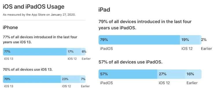
Apple shared an update that iOS 13/iPad OS 13 adoption has almost hit 80% for iPhone s and iPad s introduced within the last four years.
For all iPhone s, the iOS 13 install base is at 70%, that’s up from 50% compared to last October. For all iPad s, iPad OS 13 adoption increased to 57% from 33% reported in October.
After a long process, we thought of starting with iPad versions and move to other OS platforms at a later stage. Meanwhile, there are a lot of
Key Challenges faced while performing testing on iPad browsers which includes
1.Different Screen Sizes
Even though iPads have fewer screen size options, but still there is a considerable difference between the screens of the iPad mini and iPad pro, hence it is crucial to ensure that the web app screen elements are compatible across all iOS devices.
2.OS Versions
Like Android, Apple also provides continuous iOS updates either quarterly or yearly, and iOS users often upgrade their device to the newest version at the earliest. This means we have to test the web app across all iOS versions to ensure every user gets the same experience.
3.Usability
Irrespective of the screen size of an iOS device, a web app should be able to represent its data in a way that fits into every screen size. But, it becomes a challenge to keep the interaction simple and precise for the user while displaying all the necessary data. Another drawback that could affect usability is font size and readability. When testing web apps on iOS devices, it is crucial to pay attention to the size of the click areas while ensuring that texts are readable.
4.Slow Loading
Most web applications often load slowly on iOS devices, either due to increased internet traffic or performance of the web app. Thus we need to carry out performance testing on every version of iOS devices to ensure that web pages upload quickly on every browser without crashing.
5.HTML and CSS Validation
If the HTML and CSS in our web app are not validated properly, it will render our website content differently based on their rendering engine. This error usually occurs while accessing a web app with Internet Explorer and Chrome browser.
6.Cross-Browser Compatibility
Safari might be the pre-installed browser in iOS devices, but that doesn’t mean people don’t use other browsers on iPhones or iPads. And that’s where the need for cross-browser compatibility occurs. Even if individuals are using the latest iOS update, it doesn’t mean that they have access to the latest browsers on their devices. Also, every browser has its own rendering engine, which allows it to behave differently on different devices thus it becomes mandatory to perform cross-browser compatibility of a web app on iPads.
Security Ensuring security becomes a significant task for testers as well. We would execute several scripts to ensure information security breach activities.
Why LambdaTest?
A developer-oriented browser that provides users with a development workspace to test their website’s responsiveness over a variety of device’s viewports.
- Real-time Simulator Testing
- Secure Shell Tunnel
- In-expensive device lab for iPad versions
- Integrated with all iPad versions (single click)
- Integrated Dev Ops tool for debugging
- Take Screenshots & Videos and share them
- Customizable screen resolutions, the comparison view
- Can run responsive tests simultaneously across devices
- Test Instantly on Different Device Viewports.
- Debug on different viewports Side by side.
Hence, we opted for the ” https://app.lambdatest.com/ ” tool to execute our responsive testing.
Given below are a few common factors that we encountered in the entire responsive testing process for our portal:
- We performed this testing for different screen sized screens (listed below) in iOS platform and various resolutions (listed below) for consistency
- It is a very common defect that we found while testing the browser compatibility the pages do not load as expected when navigated among the different links of the living matrix portal. At times, it happens that the links are missing, or the images are not loaded or timed out while playing with the navigation.
- We executed complete responsive testing for the entire site to verify all types of images and functionalities are shown as expected on all the below-listed iPad versions.

OS Versions tested:
| Device Name | Resolution | Generation | OS Version |
| iPad | 768px X 1024px | 5th & 6th | 12.4 |
| iPad | 768px X 1024px | 7th | 13.6 |
| iPad | 8th | ||
| iPad mini | 768px X 1024px | 4th & 5th | 12.2, 12.4 |
| iPad mini | 768px X 1024px | 5th | 13.6 |
| iPad mini | 768px X 1024px | 5th | |
| iPad pro(10 inch) | 834px – 1112px | 11.3 | |
| iPad Pro (11 inch) | 2nd | 13.5, 13.6 | |
| iPad Pro (12.9-inch) | 1024px – 1366px | 3rd | 13.3 |
| iPad Pro (12.9-inch) | 1024px – 1366px | 2nd , 3rd& 4th | 12.0, 12.2, 12.4, 13.6 |
| iPad Pro (12.9 inch) | 1024px – 1366px | 3rd | 13.5, 13.6 |
Conclusion
Tablet responsive testing plays an important role to ensure that every user (desktop, laptop, mobile, or tablet) gets an optimal viewing experience across devices. As a team, we have put tremendous effort to execute this responsive testing for the “Healthcare application – Patient portal” in order to make the best user-friendly experience.